Note: This guide was originally published as a Cornell University Library LibGuide.
Purpose of this guide
This guide is intended to get researchers started with using collections (of images, texts, audio, etc.) as data for computational analysis, visualising data to enhance research processes and products, and using computation to present and analyse collections data and metadata. This guide is not intended to be a comprehensive document on how to do everything, but hopes to introduce researchers to digital collections-based methods. If you’re looking for a guide on data visualisation, you’re in the right place! This guide serves as a natural companion to the Text as Data: Finding and Mining guide.
If you have not already, please read the Introduction to collections as data section of this guides site before you continue.
Understanding data
There are so many definitions of data that exist, depending on who you ask, what data they work with, or what their motives are that no one definition can cover it all. For example:
“Data (/ˈdeɪtə/ DAY-tə, US also /ˈdætə/ DAT-ə) are a collection of discrete or continuous values that convey information, describing the quantity, quality, fact, statistics, other basic units of meaning, or simply sequences of symbols that may be further interpreted formally.” –Wikipedia
“Data is a collection of facts, numbers, words, observations or other useful information. Through data processing and data analysis, organizations transform raw data points into valuable insights that improve decision-making and drive better business outcomes.” –IBM
“Data can be pretty much anything, really. Or rather, pretty much anything can be data…. Data isn’t just numbers, though it often is reduced to that. It’s discrete packets of evidence that we can potentially aggregate to find patterns and meaning. It’s testimonies, field boundaries, the human genome, the avocado genome, a bottle of wine, a packet of crisps, the complete works of Shakespeare…” –University of York Skills Guides
We often think of data as figures on a spreadsheet, something technical and quantitative that is written in code or numbers, objective facts that can seem almost indecipherable to the average person who stumbles across it. But data can be, as the University of York defines above, “pretty much anything”. For example, the following picture of my cat is data:

And it’s not just data because it’s a JPEG image file that includes pixels, color data, and other graphical information related to the image. The photo tells you that there is, somewhere, a cat. It tells you that my cat is brown and orange and black. The filename tells you that my cat’s name is Camilla. It tells you that my cat is extremely cute. It even tells you that I am a person who takes pictures of my cat (who doesn’t?). All this to say that data is, essentially, any “thing” that can be used to derive or find meaning.
Data can come in many different media or formats. Some common ones you might have seen before include:


Datasets
When we talk about a dataset, we’re referring to the group or collection of data that can be read by a computer or machine at one time. Often datasets must be formatted in a particular way so that each piece of data can be read the same way by the computer and distinguished from one another. An example of this is tabular data, or data arranged in a table, which is used frequently as an example throughout this guide.
Data ethics
CARE and FAIR Principles of data
The CARE Principles for Indigenous Data Sovereignty are a set of guiding principles for the inception, creation, use, archiving, and control of data that affirm and ensure the rights, personhood, interests, and respect of Indigenous Peoples. The principles were created in response to the historical and continued use of data about Indigenous Peoples against them by private researchers and government entities and the marked exclusion of Indigenous Peoples from access to, use of, and benefit of data about them, even within the open data movement.
The CARE Principles are linked closely with the FAIR Guiding Principles for scientific data management and stewardship, a set of principles for finding, accessing, ensuring the interoperability of, and reusing data. The intention behind both sets of principles is to make access to and use of data less exclusive, to ensure the rights and respect of peoples creating and being described by data, and to hold data creators, brokers, users, archivists, and other stakeholders accountable for their creation and use of data. The CARE and FAIR Principles are:
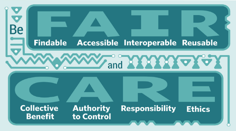
You can read more about the CARE Principles from the Global Indigenous Data Alliance.
Consentful tech
The consentful technology movement emphasises that digital applications should be built, managed, and used with the following conditions for data collection and use in mind:
- Freely-given: Consent for use of data or a part of someone’s “digital body” should be freely-given, without coercion, duress or pressure, by that individual.
- Reversible: Consent for use of data or a part of someone’s “digital body” should be capable of being revoked by that person.
- Informed: Both the user and creator/owner of the data or “digital body” should know and be honest about the full conditions of use/reuse for that data.
- Enthusiastic: Consent for use of data or a part of someone’s “digital body” should not be begrudging or induced through social guilt.
- Specific: Consent for use of data or a part of someone’s “digital body” should should be specifically applied only to the pieces of data mutually specified and agreed upon by the parties, not all of someone’s data or unspecified additional data.
The intention behind the movement is to combat the rampant theft and/or unwitting use (through those gigantic, long terms and conditions documents that corporations make you sign before using a service) of personal data by big corporations and companies who profit off of that data without informing or giving a cut to the owner/creator of that data. Read more on the Consentful Tech Project site, which is a collaboration with Data for Black Lives.
Understanding metadata
Metadata is literally “data about data”. μετα is a Greek preposition and prefix meaning “with”, “next to”, “after”, or “beside”, so meta + data is data with data. You see metadata all the time and probably don’t realise it. One example of metadata are the labels that you see next to artworks in museums.

These labels describe a piece of art briefly by listing the artist, the title of a work, the place of origin, the date, and other descriptive information that gives you context about the work. This information is often called tombstone information. Museum labels sometimes have longer descriptions of the work too. You can think about creating metadata for your collection items like creating tombstone information and descriptions for them.
The difference between print metadata and metadata for a digital collection, however, is that a computer doesn’t innately understand that “Irving R. Wiles”, for example, is the name of the artist who created the work or that “oil on canvas” is the medium. This is where metadata schema come in. Each metadata scheme consists of a list of fields, which are the categories that pieces of metadata about a work fall into. For example, “artist” would be a field and “Irving R. Wiles” would be the value that is filled in for that field.
Metadata schema also usually contain rules for how the values in each field are structured and arranged, like whether they’re uppercase or lowercase, can include punctuation, should be abbreviated, and more. Metadata fields also have to be specific enough to at least distinguish all of the items in a collection from one another. For example, only having the fields “colour” and “medium” for a collection of red ceramic vases is pointless, since the metadata would look exactly the same for every single item.
Wait, what’s the difference between metadata and data?
On a basic level, if your data can be used to describe a specific collection or piece of data, then it is metadata. If your data is the top-level thing you’re describing, then it’s data.
But metadata is also data in its own right. And you can have metadata about metadata. Data can also become metadata in another context, and vice versa. So the real distinction is in what terminology you’re using to describe what you have in front of you. For example, take the data and metadata below:

We have the map, which is the data or image that the General Info section is describing; and the information section with metadata about the file. But if I take a piece of that metadata, like a collection of all the types of image file formats with definitions and examples, the metadata “PNG image” could become data in its own right. And if I use this map as one of my examples, the map could become metadata.
| identifier | title | full_title | description | date | creator | example |
| obj1 | PNG | Portable Network Graphics | a type of lossless raster image file | 1994 | Thomas Boutell |  |
| obj2 | TIFF | Tagged Image File Format | a computer file used to store raster graphics and image information | ca. 1980 | The Aldus Corporation |
How is metadata created?
It may seem sometimes like metadata just appears or that the metadata that is chosen to describe a piece of data is just common sense. In the museum label above, for example, you might think that writing the artist’s name, “Irving R. Wiles”, is a fairly straightforward decision. However, metadata is never created in a vacuum. Cultural biases, societal power structures and hierarchies, financial influence, politics, and many other factors play into how things are described using metadata and why they are described using specific metadata.
A prominent example of metadata issues and bias can be found in the Library of Congress Subject Headings, which is the predominate, authoritative metadata scheme for cataloging librarians who assign metadata to books. One such publicised issue arose when the LoC announced in 2016 that it was going to be revising the subject heading “Illegal aliens”, given that activists, librarians (including the ALA), and lobbyers decried the term as dehumanizing. In response, lawmakers in support of stringent immigration law attempted to introduce policy that would prevent the change or require the LoC to retain the “Illegal alien heading”. In 2021, the heading was finally changed to “Noncitizens” and “Unauthorized immigration”, a middle ground between some politicians and the wishes of the general public that satisfied no one. You can read more about the issue on Wikipedia.
Another example of potential bias in metadata creation is the use of artificial intelligence to assign metadata to images, texts, files, and other works. While AI is able to recognise, with training, consistent patterns across images that can make metadata creation faster, it’s easy to forget that AI models are created by and trained by human beings, and thus suffer from all the same biases we do. AI, for example, may not be able to accurately identify race, gender, or religious characteristics in historical photographs unless given a very specific set of training materials and query parameters to do so. Even then, AI is notoriously terrible at counting amorphous shapes in large groups, like groups of people huddled close together and hands. AI can be a really helpful and powerful tool, but it’s important to remember what’s behind the curtain.
Metadata standards
A metadata standard or metadata scheme is a set of rules for how a defined set of metadata fields should be applied and used to describe data. These schemes include how the metadata should be formatted, the definition of each field and what kinds of values go in it, and sometimes which disciplines or types of data the metadata scheme best fits.
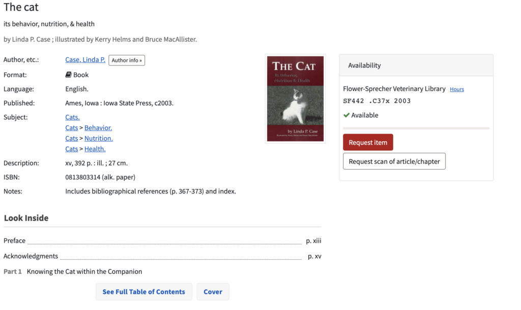
A great example of a metadata scheme that you may have seen before is in the library catalogue. The Cornell University Library catalogue uses the MARC 21 Format for Bibliographic Data, a metadata scheme for describing data about library items like books, CDs, e-resources, and more. Go to https://catalog.library.cornell.edu and search for an item in the search bar. Open the record for the book and you’ll see a list of fields and values that describe the book, like author, format, language, edition, and more. These are the public-facing metadata fields, and the same fields are used for every item in the catalogue. If you scroll all the way to the bottom of the record, there will be Librarian View button. If you click on the button, you’ll pull up a page that shows all of the metadata fields and values for that particular book in the MARC 21 Format for Bibliographic Data. These are the fields that the computer understands and that are added by librarians on the back end of the catalogue. See the public facing and librarian view metadata for The cat: its behavior, nutrition, & health below:

How do I make my own metadata?
In order for metadata to be useful for describing a thing or collection of things, it should have the following characteristics:
- Purpose-driven: Metadata has to be created with a specific purpose or collection in mind, so that it can fit directly with the data it describes.
- Specific: Metadata must be as specific as needed to adequately distinguish items, which may be similar, from one another by metadata alone. This means that in most cases, you shouldn’t need a photo necessarily to distinguish between two different objects. For most collections, the metadata for two different “things” or pieces of data should not be exactly the same.
- Contextual: Metadata has to be created within the context of the “things” or data it is describing and the audience that will be reading the metadata. For example, metadata for a museum collection should use terms that museum professionals, art historians, and the public can all understand. Museum labels should also specify how the item was acquired, where it is, and provide other contextual information that allows you to truly understand the object on the whole (note that museums don’t always do this in practice!).
- Respectful and responsible: Metadata should be created with the rights, preferences, opinions, and lived experiences of the people and cultures it may describe in mind. For example, museum labels that describe a piece of art created by a Winnebago artist as “Indian”, without consulting that artist, may be stripping the artists of their identity (along with problematically lumping all tribes of North American Indigenous Peoples together).
- Standard: Metadata should be created with standardised fields that are applied to all pieces of data within a group, collection, or discipline uniformly.
- Defined: Metadata fields can (and probably should) have some sort of accessible key to identify what each field means and how it is used. For example, the fields “topic” and “subject” are similar, so it would be important to describe what makes them different to someone accessing your metadata. As you’re making decisions about what fields to use and how to use them, write these thought processes down for later.
For an example of why these attributes are important, try the first metadata exercise below:
Metadata Exercise by Kiran Mohammadi-Williams
As the examples in the Blue Fish Plate exercises demonstrate, trying to compare two objects with completely different metadata schema or with incomplete sets of metadata is pretty much impossible. Are “date” and “period” just different terms for the same field? What is a “related term”? When was the period of the Yuan dynasty? How do you depict time? When you create your own metadata scheme, make sure it is purpose-driven, specific, contextual, respectful and responsible, standard, and defined so that you are describing your data in the best possible way.
Making your own metadata
1. Gather all of your data
In the How is metadata created section?, we discussed the important characteristics of metadata, including that it should be specific and contextual. In order to be specific and contextual, you need to know what all the things you’re going to be describing are, or at least what type of “thing” they are. Gather all of your things in one place so you can look at all of them and compare/contrast them at once. If your things are images, PDF files, and videos, place them all in the same folder on your computer. If your things are a group of print books, place them all in the same room in front of you.
2. Define your fields
Take a good look at all of the things in your collection. What characteristics do they have? What characteristics would you use to distinguish them from one another? Come up with as many fields (color, style, type of data, title, location, etc.) that you need to make sure no two things can be mistaken for one another. Write all of these fields down.
3. Define your rules and standards
Think about what each of your fields mean. If you have a color field and a description field, should you put the color in the description as well? If you have a location, how will the value in this field be formatted (e.g. “New York, U.S.A.” or “NY, United States of America” or “-76.486794, 42.843751”)? Is there a maximum to how long the title or name of a thing should be? Write all of these rules down too.
4. Check your fields and rules with the appropriate communities
If your data is about/for a specific individual, culture, or group of people, verify with that community or individual that you are describing them as they would like to be described. You can find best practice manuals for description published by lots of different communities on the Internet, like the Respectful Terminology Platform Project. If you’re creating metadata about an individual, you can use resources like ORCID, the Virtual International Authority File, and the Library of Congress Name Authority File, with the caveat that the Library of Congress sometimes gets it wrong. The best thing to do would be to include which name authority or other authoritative source you used in your metadata key so that users are aware of which authority file they should lobby when things aren’t right.
5. Fill out your values
Go object by object, field by field and assign values to your things. You can see how to create a metadata sheet for your data in the Creating your own dataset section of this guide.
6. Check it once, check it twice
Check your metadata over to make sure everything looks good and that all of your fields are uniform and have adequate context. You can have a friend try to describe something using your metadata scheme to test whether it’s understandable for someone other than the creator (you).
7. Make changes
It seems contrary to the “standard” characteristic of metadata that it should be changeable, but metadata is constantly changing and evolving as the data changes and as we learn more about people, progress as a society morally, take action to redress past wrongs, and gain more knowledge. Be open to making metadata changes when needed, and be sure to seek help from librarians if you have trouble finding or making a scheme that best fits your data.
Gathering data
For collections-as-data work, your dataset can be anything from a group of objects in a particular museum collection to a list of films produced during a certain period of time. The only criteria is that the data must form a collection or collections. While we often work with visual media like images and video as our digital objects in a dataset, your dataset can be a collection of texts as well. Some places to find datasets include:
- Responsible Datasets in Context
- Academic library digital collections
- Large museum collections
- Library of Congress Selected Datasets
- Awesome Public Datasets
- Open Knowledge Labs
- Any public CollectionBuilder project or GitHub repository
While there are some places you may find pre-made datasets, it’s often necessary to create your own multimedia dataset so that you can explore hitherto unearthed trends, patterns, and absences within collections and interpret them. One of the differences between text analysis and collections-as-data analysis is that the latter can include materials across different media and formats using a single metadata scheme.
For any individual digital objects and data that you work with, you should consider copyright & license restrictions, depending on where you would like to collect the objects. For example, some images available in Cornell University Library’s digital collections have restrictions on what you can download and how you can use those images.
Creating your own dataset
Before you can begin to create your own dataset, you need to understand metadata. Metadata is the backbone that drives search and discovery across many public-facing digital collections and exhibits. Metadata is what distinguishes digital objects from one another and is what the machine can read to find patterns across digital objects and collections. If you do not have a strong grasp of metadata, please see the understanding metadata section before continuing.
Metadata for digital projects is often stored in spreadsheet technology, though it can be stored and hosted in any place where it will maintain its regularity and standards, where it can be downloaded and read OR read directly in a machine-readable format, and where it can be easily tied to the digital object it describes. Spreadsheets are a way to create tabular data, which is a data type that most machines are capable of parsing. Spreadsheet software is also usually free, open-source, freely-hosted or host-free, and accessible, making it perhaps the best option for putting your datasets together.
Picking a Spreadsheet Tool
What spreadsheet tool you decide to use should be dependent on a few different factors: reliability, ease-of-use, and budget. Some tried-and-true spreadsheet tools are:
The tool doesn’t particularly matter, as long as it can export files into commonly-used file formats for computational work like CSV and TSV. If the program you want to run your dataset through uses a file format that your spreadsheet tool does not export to, you’ll have to use some sort of external file convertor like Cloud Convert, which is not always easy or secure.
Filling in your spreadsheet
In the Understanding Metadata section, we discussed how to devise a metadata scheme. If you haven’t already, go see that section first so you know what metadata fields you’ll be adding to your sheet.
Below is the basic structure of a metadata spreadsheet. The first row is a special row that includes all of your fields across the top of the spreadsheet. Each row after that (rows 2, 3, 4, etc.) are for an individual thing or piece of data. The first row, first column (A1 on most spreadsheets) is where you put the unique identifier for each object. Each column is a different field.
| identifier | field 2 | field 3 | field 4 | field 5 |
| thing1 | ||||
| thing2 | ||||
| thing3 | ||||
| thing4 |
For an example of how this works, see the sample spreadsheet below. Row 1 is for my metadata field. Each metadata field then has its own column (A, B, C, D, etc.) and each thing or piece of data has its own row (2, 3, 4, 5, etc.).
Green highlighted fields indicate fields that are required by the software I want to put my data into. Most software/tools have required fields that you must include in order for the tool to be able to properly process your spreadsheet. It’s easiest to look these up before you create your metadata spreadsheet, but you can always add them in later.
To sum up, the basic steps for filling out your spreadsheet are:
- List out your metadata fields across the top row of the spreadsheet. Make sure to check whether the software/tool you want to put your data into has any required fields.
- In the column that has the identifier field, list out the identifiers for each item in each row down the column (A2, A3, A4, etc.). You’ll be creating a new row for each item.
- Fill out the rest of the values for each item, according to the field that’s in each column.
- Download your file in whatever format your software/tool needs. Most collections tools, for example, accept comma separated values (.csv) files. A good spreadsheet tool will be able to download and share your metadata spreadsheet in a bunch of different file formats.
Visualizing Data
What and why is data visualization?
Data visualization is the representation of data and information graphically, through pictures, videos, or some format that can be perceived by the eye. Visualizations can range from charts and graphs to maps to games and more.
Deciding whether your project data should be and could be visualised involves asking yourself a few questions:
- How would visualising this data differ from presenting it as-is?
- How would the visualization transform the meaning or accessibility of the data in some way?
- Is the effort/labour of visualizing equivalent to the benefits of visualizing?
- What kind of visualization best fits my dataset?
- What are my current technical skills? How much can I or am I willing to expand my technical skills to be able to work with a specific program or tool?
- What’s the scope and timeframe of my project?
- Who is my audience?
For example, qualitative data can be more difficult to map using typical charts and graphs like bar charts, histograms, or plots because there aren’t any numbers than can be easily and objectively assigned to values. Similarly, it can be difficult to use a network diagram to visualise quantitative data because there may not be direct 1:1 relations between different numbers and statistics, numbers may be repeated, and it can be difficult to understand what the numbers mean in a network context.
Above all else, we at the Digital CoLab believe that data visualization should be intentional. The visualization should contribute to the analysis, interpretation, or sharing of the data in some way that is not already apparent without it being visualised. Visualizations should do something or say something more.
How do I get started?
It can often be daunting to take your data from spreadsheet or group of loose Post-Its and turn it into something visual, especially with the gigantic pool of tools that exist to help you do that today. T
1. Gathering and cleaning your data
The first step, however, isn’t to figure out what you’re going to use to visualise your data, but to make sure you have your dataset together. Cleaning and organising your data is necessary for you start visualizing, since many programs and tools require your data to be in a particular format to read it properly. Before you continue below, see the section on cleaning your data.
2. Finding best-fit visuals and functionality
After you’ve got a relatively clean dataset, the next step is to decide what you want your visualization to look like and what you want it to do. For example, if my dataset is a collection of red ceramic vases from North American museum collections, I could visualise those on a map to show the distribution of the collection across space. Or I could assign them tags and visualise them using a network graph to show which objects share particular features. Or I could make a chart showing the amount of red ceramic vases in collections over a period of years. There are many aspects of my dataset that I can visualize, so I have to determine which one (or if all of them!) would let people understand my data best.

A chart might be redundant, since I could simply say in text “the amount of red ceramic vases in museum collections increased drastically over X number of years.” A map, however, may be more useful, since it can be difficult to imagine three-dimensional space and geography through text and the map also demonstrates which areas have the most ceramic vases, saying two things in one. These are just some ideas; it’s up to you to decide what is most important to you to visualize and how you think visualizing a particular aspect of your data will improve understanding.
3. Determine your values
When you’ve decided what you want your visualization to look like and do, you’ll have to find a tool that can help you do that. Before you select a tool, however, it’s important to determine what your values are for visualizing your data. Software and tools are often owned by corporations, some of which have paywalls or may espouse values that you disagree with. At the CoLab, for example, our values include prioritizing open-access, minimal computing approaches whenever possible, which means the first tools we reach for will fit those values. For someone creating a public-facing collection of Indigenous data, they may want to use a tool created and managed by Indigenous people to make sure that their research is giving back to the communities it benefits from. Do your research and make sure you’re choosing a tool that fits your project and your person.
4. Selecting a tool
Selecting a tool can be difficult, since you need to find something that meets your visual needs, your functional needs, your values, and your resources (budget, technical skills, capacity for maintenance, project team size, etc.). We can’t tell you exactly which tool is “right” or “wrong” for your project, but see the Selecting a tool section for some general guidance.
5. Trial and error
Designing a visualization can be difficult, but it’s important to remember that trial and error, getting feedback from others, and making changes is all part of the process. Take time to test out and explore different visualization types and methods, and don’t be afraid to use a new tool or ask for help when you need it.
6. Publishing your visualisation
The last step will be deciding if and how you will make your visualization public. If your data is being put into a collection tool or website, your tool will likely have embedded structures for publishing to the web. If you’re including your visualization in a paper, look up options for downloading the visualization as a high-quality image file or, if your visualization is interactive, publishing your paper in a born-digital format.
Because of the specificity of all of the different factors in designing, creating, and publishing a visualization, your best resource will always be your own research and trusted experts, like librarians, who can give you advice tailored to your specific circumstance. Digital Scholarship Services is happy to help direct you on the best way to visualize your humanities or social sciences collections dataset!
Selecting a tool
There are so many visualization tools available that can be used to create your project. You can find the Digital CoLab’s curated list of data visualization tools, along with guides for some of them, on the Digital Scholarship Services Guides site.
When selecting a tool, there are a few things you may want to consider:
- Does this tool do what I want it to do? If it’s open-source, can I make it do what I want it to do?
- Do I have enough technical knowledge, or can I reasonably gain the technical knowledge within my timeframe, to use this tool? Do I have resources to help me figure out how to use this tool?
- Do the values of the company that created and manage this tool align with my own? For example, is the tool free, open-source, open-access, web-based, etc.? Does the company responsibly use the data it collects from users?
- Does the tool host my project itself or will I have to host the project on my own?
- Does this tool have good documentation?
After you’ve determined what you’re looking for, it can be helpful to just browse tools and shop around. See what’s out there, what you like and what you don’t. Make note of features you like in one tool that might be able to be integrated into another. Ask a friend. Come to the CoLab and get our opinion.
What do I do if I can’t find the right tool?
If you feel like you’ve searched the entire World Wide Web and you can’t find a single tool that works for you, contact the Digital CoLab at digitalcolab@cornell.edu. It’s our job to help you find a tool that can work for you or to help you find ways to achieve the data visualization that fits well with your project.
Tools for visualizing and publishing data
- Collections & platforms – Digital Scholarship GuidesWelcome to the collection platforms & tools page! Discover your new favourite way to make an engaging digital collection, database, visualization, map, and other public-facing piece of digital scholarship through the list of tools available below. This list is by no means exhaustive, and prioritizes open-source, free tools when available.
- DataVisualization.CH
- dataviz.tools
- Data Viz Catalogue
- Visualising Data – Resources
- Data Visualization: Visualization Types
- DiRT – Data Visualization
- University of Arizona, Digital Humanities Tools: Data Visualization